|
A style is a template which controls the look and feel of the content
area home page (root folder), folder area, banners, and navigation
bar. This template governs the colors, font properties, size,
background images, banners, and other graphical elements that are
common across the content area.
Default and custom styles
When a content area is created, two default styles are provided with
the product. One is applied to the folders in the content area, the
other is applied to the navigation bar in the content area. As an
authorized user with the "Manage Style"
privilege, you can apply the default styles, or you can create custom
styles to suit your own needs. One style can be used for your entire
content area (the home page and each folder), or you can assign
different styles to give each folder a distinct look and feel.
Typically, you will want to either edit these default styles or
create your own styles.
How styles are applied
In addition to being highly customizable, styles can also be applied
in many ways depending on how you want your content area to look. For
example, if you want your navigation bar and folder area to have the
same color schemes and link text properties, then you might want to
apply the same style. However, if you want the navigation bar to have
a completely different color scheme, then you should apply a
different style to the navigation bar. You can create as many styles
as you want for a content area and apply whichever style you want to
any folder or navigation bar. You can see a list of all your styles
for each content area from the Navigator
by navigating to Path: Content Areas
> Name of Content Area > Styles.
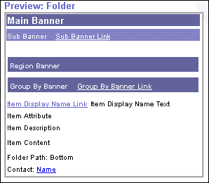
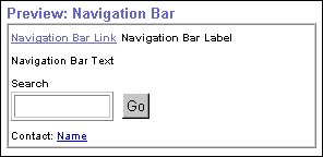
Style elements
Style elements that you can set include the main banner, sub banner,
region banner, group by banner, item attributes,
style elements, and navigation bar style elements. When you choose
the style element's color, font properties, and other settings, the
results of your choices are immediately reflected in the style
previews. Style previews are available for both the folder
and the navigation bar which are shown below.
Arrangement of Items
Oracle Portal supplies five default folder layouts that define how
the different regions of the folder can be arranged. The folder
region layout determines the overall flow of items and
sub-folders as well as how items are arranged in the folder area when
the folder is rendered.
Note: Item attributes such as
Author, Description, Expiration Date, Image, New Item Indicator, and
so on are displayed in the folder area only if they were chosen to
display. For more information, see Choosing
item attributes to display in a folder region.
Style Privileges
Tasks that you can perform on a style are determined by your style privileges:
-
The content area administrator or style
administrators with Manage Style
privilege, or creator of the style are authorized to perform all
actions on styles in the content area including create,
delete, and edit style properties.
-
By default, folder owners can assign the
"Edit Style" privilege at the folder level to users who are
not style administrators. Users with this privilege can choose
another style to apply to a given folder. For more information, see Granting
access privileges to your folder.
-
By default, folder owners are authorized
to apply another style to the given folder. However, the content area
administrator may choose to revoke style
privileges from folder owners to enforce a consistent appearance
across the content area. In this case, folder owners and authorized
users with the "Edit Style" privilege can create a new
style but they cannot apply the new style to the folder. Only the
style administrator or content area administrator can apply the new
style to the folder.
Accessing the Style Manager
All style settings for the folder, banner, and navigation bar are
configured entirely in the Style Manager. The Style Manager allows
you to customize any style element regardless of how you access it.
The access methods are listed below:
-
Click the  Folder Style link on the folder dashboard.
-
Click the  Style tab in the Folder Manager.
-
Click the Nav Bar Style link on the navigation bar. |